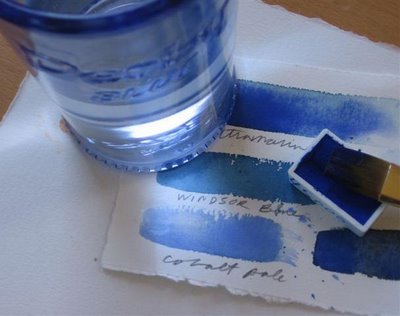
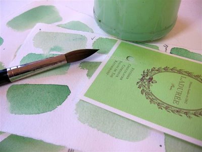
 I have a bag full of color test sheets I can't throw out.
 One of the 1st watercolor lessons you learn is to test out your colors on a paper scrap before putting brush to expen$ive watercolor paper.
I get attached to the test color scraps. Sometimes they're better than the so-called 'work of art'. After watercolor class I'd go round picking up the test scraps off the floor. The colors were lush, splashed on freely. Some of my own color test scraps are far superior to anything else IMO.
 People tear their hair out daily trying to get their walls to look like some swatch of paper with a divine color on it. They've fallen in love with that color and will settle for nothing else = it's madness. Has this happened to you?
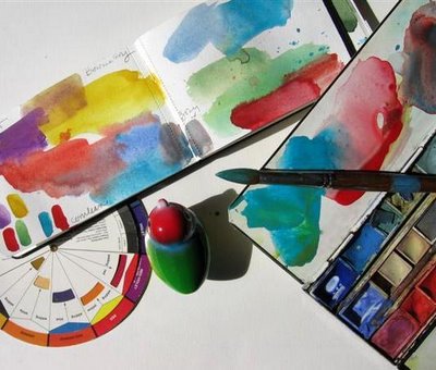 In many PB posts I'll mix up and match paint colors to whatever I'm writing on about, whether it be macarons, chocolate, swimming pools, cherries, toy birds, ice cream, orange, red, black, pink.
 Long ago I took a color mixing class at Parsons. We could only use 3 primaries - RED + YELLOW + BLUE. We mixed colors until we were blue in the face for 6 weeks.

 People tear their hair out daily trying to get their walls to look like some swatch of paper with a divine color on it. They've fallen in love with that color and will settle for nothing else = it's madness. Has this happened to you?
  In many PB posts I'll mix up and match paint colors to whatever I'm writing on about, whether it be macarons, chocolate, swimming pools, cherries, toy birds, ice cream, orange, red, black, pink.
  Long ago I took a color mixing class at Parsons. We could only use 3 primaries - RED + YELLOW + BLUE. We mixed colors until we were blue in the face for 6 weeks.
Mixing GREENS is always difficult.
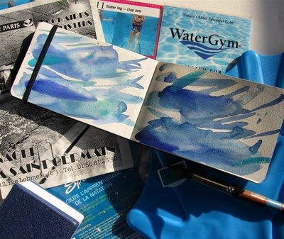
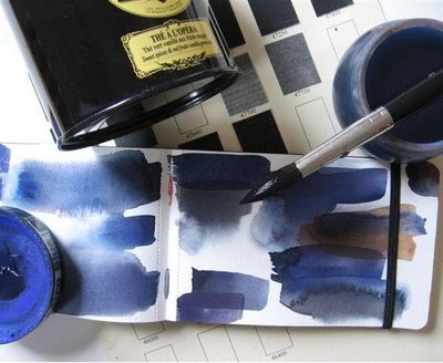
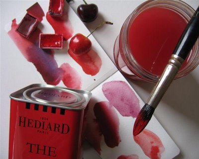 That's the thing about color. It's so easy to fall in love with color. I thought I was mad for RED. All those ridiculous personality tests where they ask you your favorite color, I always put RED. But now I realize it's BLUE I can't stop using all over the place.
I took Dr. Lusher's color test for this post.
It told me:
Hungers for intensity in life and welcomes opportunity to take on challanges.
It told me:
Hungers for intensity in life and welcomes opportunity to take on challanges.
I love color mixing and matching.
It's one of those nice meditative, mindless activities you can do endlessly, yet at the same time is quite challenging. It's not as easy to match a color as you'd imagine.
No comments:
Post a Comment